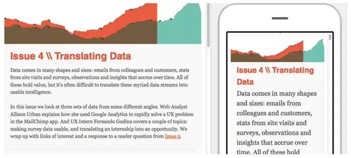
Increasing Engagement by Creating Mobile Friendly Content
Mobile has become one of the fastest growing platforms in digital marketing. Mobile digital media time in the US is now significantly higher at 51% compared to desktop (42%). This can be attributed to the fact that people are always on the go and with the development of the android, information is more available anytime, anywhere.Mobile has become an integral part of people’s lives and among them is your target audience. If they spend as much time on their mobile than on tv or their desktop, then it should be one of the core aspects of your digital marketing strategy. There are different platforms even on mobile. With mobile users rising in number, internet behaviour has changed the trend in digital marketing. The leading platforms are still Facebook, YouTube, Twitter and Instagram but even with these social media networks forging a strong following, you should not forget about messaging services like WhatsApp and Messenger.

So how do you make sure that your content is mobile friendly? Aside from the basic information that earlier mobile optimized web pages contained (ie, operating hours, contact info, address, products or services), you should consider key aspects in your content for a better mobile experience.
5 Things to Consider to Create Mobile Friendly Content
Readable font sizes
When deciding on font styles and font sizes, you have to consider its readability. Remember that on mobile devices, texts tend to look smaller than on regular desktop screens. Start with simple font styles and font sizes that are easy to read for optimal user experience. Consider the space it occupies to limit the need for zooming in and out of the screen.
Shorter Paragraphs

Keeping paragraphs short would encourage readers to be more engaged. When the paragraph looks long on a mobile screen, this discourages the reader to go on further prompting him to leave or move on to other sources.Keep paragraphs short down 2 to 3 sentences. It may look short on desktop screens but even medium sized paragraphs look long on mobile screens.
Beautiful Images/ Design

Images add a certain je ne sais quoi to content. Use beautiful images to support your content but do not overpopulate it where it’s not necessary. Eye-tracking studies indicate that mobile users look at images more than they look at text. What’s the takeaway for copy? Use fewer images. They take up precious screen space. If the image doesn’t advance your point, don’t use it for mobile.
Concise writing

Blaise Pascal, wrote, “I have made this longer than usual because I have not had time to make it shorter.” Concise writing takes time and hard work. For mobile content, providing good information with only few words is essential. Keep in mind that in mobile, screen size should be considered more than the user’s attention span. Your readers should be able to get as much information without so much as swiping or tapping to get more.
Short, Strong Headlines

Headlines are meant to attract attention with a snapshot of the full content. It does not need to take up space on a screen. Short and powerful headlines that attract attention are what increases conversion rates. Lengthy headlines tend to extend below the fold and chances are, readers would lose interest and skip it.Use power words to start strong. A lot of mobile readers are in a rush and scan thru material that would be worthy to read in such a short time. Always put something compelling above the fold to hook them in reading below the fold.
Responsive Design to make mobile ready pages

When building or rebranding your website, you have to consider building it with responsive design which automatically optimizes a web page according to how it is being accessed. It will not only make your website look pleasing to consumers, it will also accommodate visitors from desktop or mobile. WordPress, Tumblr, and other content management systems (CMS) are already optimized with the mobile version automatically. If you opt for a more customized site, you can also use other CMS with responsive design.When using pop ups, consider the mobile display as well. When your pop ups populate your website on the desktop version, chances are, it will crash or cover the entire screen on mobile. Your visitors might not be able to find the close button immediately and get turned off, leaving your site. Opportunities in MobileThere is a huge opportunity for service and product industries when they extend their reach to mobile. In 2016, service providers and manufacturers account for 70% of shipments worldwide. It is also said that mobile commerce will account for 24.4% of overall ecommerce revenues by the end of 2017.


RESPONSES